
.svg)
Top 5 Mistakes to Avoid When Creating Online Forms


You can find online forms everywhere. Businesses rely on digital forms to engage with their users for anything from newsletter sign-up to event registration and customer feedback collection. The main problem is that most people make mistakes.
Form creating may look simple at first, but if you're not careful in your approach, small errors can result in missed opportunities. People generally demand smooth, quick, and easy digital experiences. If your form doesn’t deliver that, you risk losing them in seconds.
The good news is that these errors are easily avoided. By understanding where most people make mistakes, you can create forms that seem more attractive and work efficiently.
In this blog, we’ll explore the top mistakes creating forms that could be hurting your results and most importantly, how to fix them. Whether you're a marketer, business owner, or product manager, you'll learn exactly how to create online forms that your users will actually complete.
Why Online Forms Matter?
Online forms are more than just fields on a webpage, they are generally your first real conversation with a user, partner, or potential customer. Whether you're submitting a support request, signing up for a product demo, or subscribing to a newsletter, they are important for practically every digital journey.
Here’s why they important:
- They drive conversions. If a form can be optimised properly, it can be the difference between gaining a new client and losing them forever.
- They influence perception. Your brand's appearance, feel, and functionality are all directly reflected in your form. A clunky or confusing form can make your business seem outdated or untrustworthy.
- They gather crucial data. Forms help you collect the information needed to personalize experiences, make informed decisions, and build long-term relationships.
- They streamline processes. A smart form may help organisations save time and effort on all from CRM changes to automation workflows.
You can increase engagement, boost conversion rates, and build stronger connections with your clients when you design online forms with purpose and user experience in mind.
Top 5 Mistakes for while Creating Online Forms
Mistake #1: Asking for Too Much Information
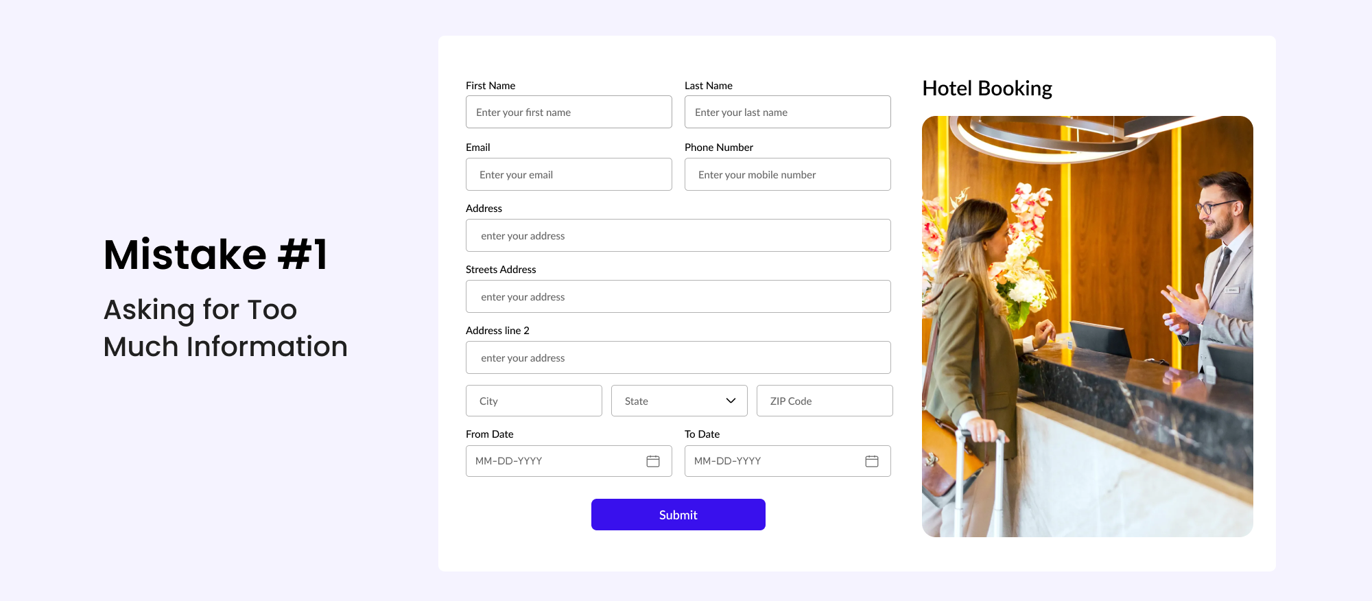
One of the most common mistakes when building forms is asking for too much information initially. While it might seem beneficial to collect everything at once, this method frequently discourages people from even starting.
Lengthy forms increase friction. Visitors usually wonder why you're asking so many questions and may feel uncomfortable submitting too much information, especially if the form does not specify how the data will be used.
How to Fix It
- Stick to only essential fields for the initial interaction.
- Use multi-step forms to simplify the process and increase completion rates.
- Implement progressive profiling to collect additional information over time.
Mistake #2: Poor Form Design and Layout
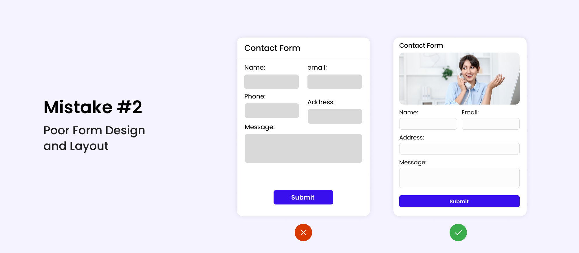
A cluttered or confusing layout can make your form challenging to understand and finish. Many users will give up a form simply because it appears difficult to fill out.
A lack of structure, improper spacing, or mismatched fonts can quickly cause discomfort to users. Plus, if the form isn't mobile-friendly, you'll lose a significant amount of your audience right away.
How to Fix It
- Group related fields using visual sections.
- For better readability, use clean, readable fonts with enough spacing.
- Make it mobile-responsive to ensure that it works smoothly on all devices.
Mistake #3: Ignoring Validation and Error Messages
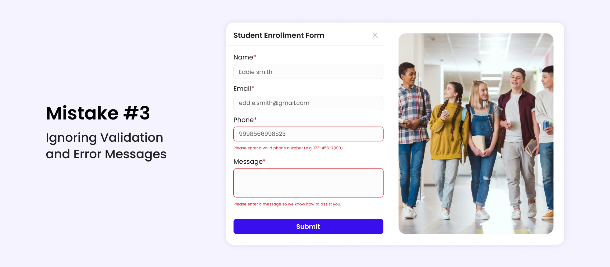
No one wants to guess what went wrong after hitting the submit button. Unfortunately, many forms still lack helpful validation and clear error feedback.
When users encounter a vague or hidden error, they often abandon the form altogether. A bad error experience can leave a lasting negative impression of your brand.
How to Fix It
- Enable real-time validation to catch mistakes as they happen.
- Display specific error messages that explain what needs to be corrected.
- Highlight errors visually with color changes or icons near affected fields.
Mistake #4: Lack of Clear CTAs (Call to Actions)
.png)
Even the best-designed form will fail to generate results if it lacks a compelling call to action. If users are confused about what occurs next or are hesitant to click the submit button, they are more likely to bounce.
Unclear, generic, or poorly placed CTAs create hesitation. On the other hand, a well-crafted CTA can encourage immediate action and increase conversions.
How to Fix It
- Use strong, actionable language like "Get Started" or "Join Now."
- Design bold, eye-catching buttons that stand out from the form.
- Create a sense of urgency or value by using phrases like "Limited offer" or "Free today."
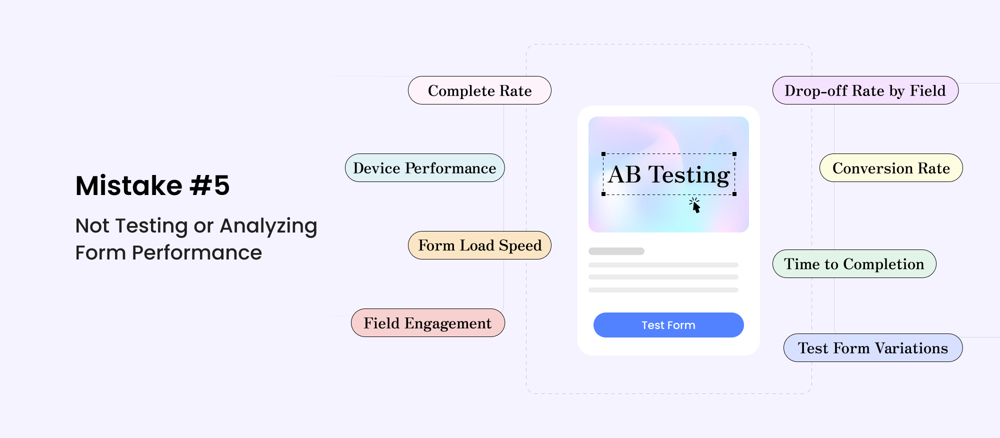
You can't improve what you don’t measure. Launching a form and never analyzing its performance is a missed opportunity to enhance results over time.
Without testing, you won’t know which fields cause users to drop off or which CTAs convert best. Tracking form analytics helps uncover bottlenecks and areas for improvement.
How to Fix It
- Use A/B testing to compare versions of your form.
- Track completion rates and drop-off points using tools like Google Analytics or Hotjar.
- Collect user feedback to identify problems from the user’s perspective.
Want to improve form conversions? Discover how smart form design practices lead to higher conversion rates and boost user engagement.
Conclusion
Creating high-converting forms doesn’t need to be difficult. Just by avoiding the top mistakes creating forms like asking for too much information, ignoring design, skipping validations, hiding CTAs, or avoiding testing you’ll be ahead of most businesses.
To create online forms that truly work, focus on clarity, simplicity, and ease of use. Avoid the top mistakes creating forms by thinking from your user’s perspective and continuously improving based on real feedback and performance metrics.
By doing so, you'll not only enhance user experience but also boost your form completion rates and business results. Start strong, test often, and optimize endlessly, that’s the real secret to form success.
Sign Up your free Account & Create Unlimited Forms
Create highly customizable and user-friendly online forms instantly using Rebolt's drag-and-drop feature.
