
.svg)
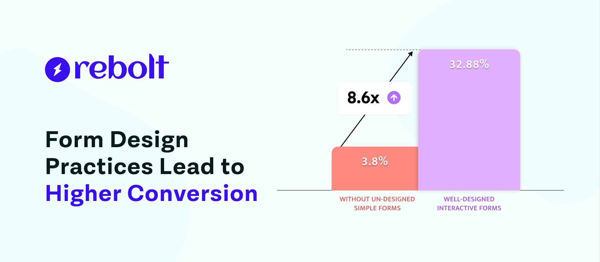
Form Design Practices Lead to Higher Conversion Rates


Form design is a factor that is beyond your mind and you can't even imagine.
Poor-looking form design can lead to losing a lot of users, whether you're just collecting users' contact details or selling a new product.
Nowadays web forms are required on all online websites and many other places. Due to this, form builders are also becoming more popular. Many people do not know how to create forms, so their form design is poor and they do not achieve good outcomes.
As a solution, we created this blog to help you design your forms properly, attract users, and increase conversion rates.
So let’s start without wasting any time.
What Exactly is a Web Form?
A web form is a part of a website section that takes information from users, sends that information to authorised servers, and performs the required follow-up. Web forms use many fields like text fields, radio buttons, checkboxes, payment buttons, review and other elements to engage with users.
There’s a web form on the WebContrive home page. It asks visitors to insert their personal details and project discussion.
The Best Form Design Practices to Higher Conversion Rates
1. Minimize the Number of Fields
Long forms may overwhelm users, leading to abandonment rate. Every extra field increases the cognitive load and friction for the user. Prioritize fields that are absolutely necessary. If you can gather additional details later, do so.
Recent studies show that reducing form fields from 11 to 4 can result in a 160% increase in conversions.
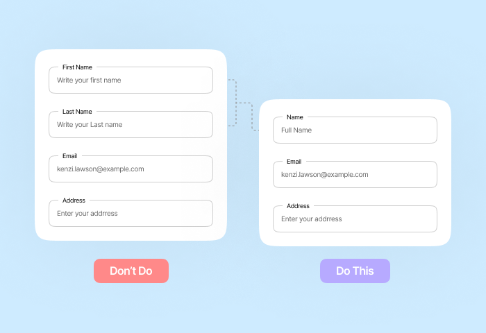
2. Optimize Field Labels and Placeholders
Clarity is key. Use right placeholders or labels to be visible even when the user starts typing. This reduces confusion and errors from users. They disappear once users start typing, which can cause uncertainty. For example, instead of “Name,” use “Full Name (First and Last)”.

Clear labels reduce form abandonment by up to 30%.
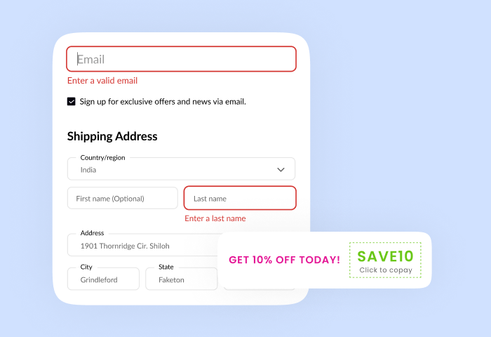
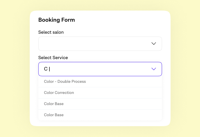
3. Optimize Field Input.
Incorrect input formats or lack of validation can lead to errors. Such as use number fields for phone numbers here you can not select normal text fields, date pickers for dates, and dropdowns for limited options.
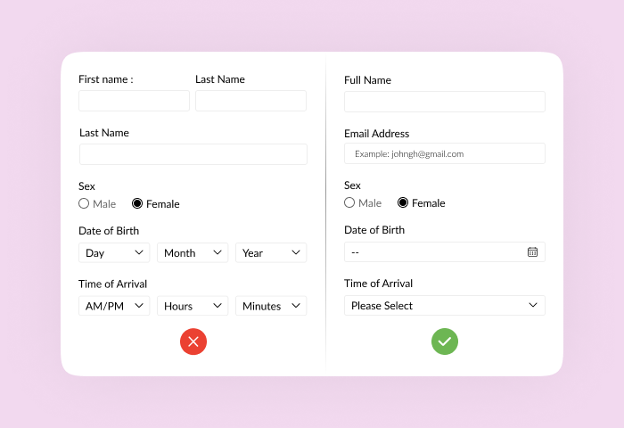
Also provide immediate feedback on wrong input, and guide users to correct their input. For example: Use a date picker for birthdates, rather than a text field.
4. Group Related Fields Together
Organize your forms into logical sections with clear headings like "Personal Information" and "Billing Details." Grouping related fields together creates a sense of order, making the form less overwhelming and easier for users to process information sequentially.

Utilize fieldsets and descriptive section headers to visually separate these groups, guiding users through the form in a structured and intuitive manner, ultimately improving completion rates.
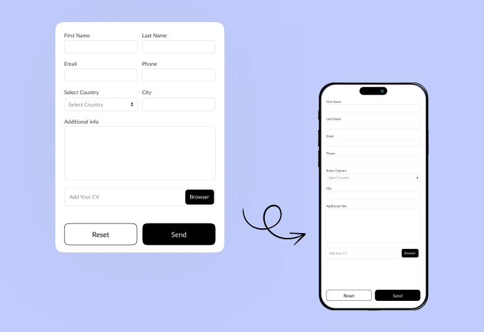
5. Design for Mobile
More than 60% of web form traffic comes from mobile devices. Forms that are not well optimized for mobile devices are difficult to use, and face high abandonment rates. Responsive forms make it easier to navigate on small screens. Also in mobile responsive form, make sure fields and buttons are large enough to tap easily for users.
A slow-loading form may disappoint the user. Optimize your mobile forms for speed using Google PageSpeed Insights to keep users engaged.
6. Use Clear, Action-Oriented CTAs
As per the marketing view every word in your CTA matters to attract users. For example, replace “Submit” with context-based CTAs such as “Get My Free Quote” or “Start Free Trial”.

Make sure the button stands out from the rest of the form for example use contrasting colour. And second is the button placement. Because it is the most important to where you put the CTAs button on form to boost click and form submission rate. Keep it within the visible area, especially on mobile.
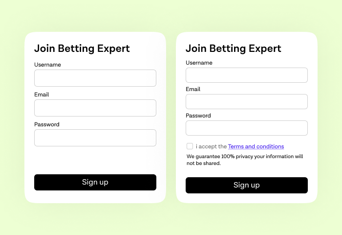
7. Build Trust with Visual Cues
Your first priority is to make users feel safe and confident. For that you can add trust indicators: Badges, testimonials, SSL icons, or data protection messages.
Second is to avoid overwhelming users and keep your form visually clean and simple. Also, display privacy policy & disclaimers near sensitive fields.
8. Enable Autofill and Autocomplete
To significantly enhance user experience and speed up form completion, use the power of browser autofill and autocomplete features. Google found that autofill reduces form time by 30–50% so helps users to move faster.
Utilize browser-friendly input types such as type="email" for email fields and type="tel" for telephone numbers. This not only optimizes the mobile keyboard layout but also allows browsers to intelligently suggest and pre-fill relevant information.
9. A/B Test Your Forms
Experiment with variations in form layout, field order, button text, and more. Daily track key metrics like drop-off points, average completion time, and field hesitation using analytics tools.
This continuous testing and analysis is crucial for identifying what truly drives higher conversion rates for your specific users, leading to ongoing optimization and improvement.
10. Show Progress (For Multi-Step Forms)
For multi-step forms, clearly show users their progress with a progress bar or numbered steps. Breaking down lengthy forms into smaller, manageable chunks prevents overwhelm and encourages completion.
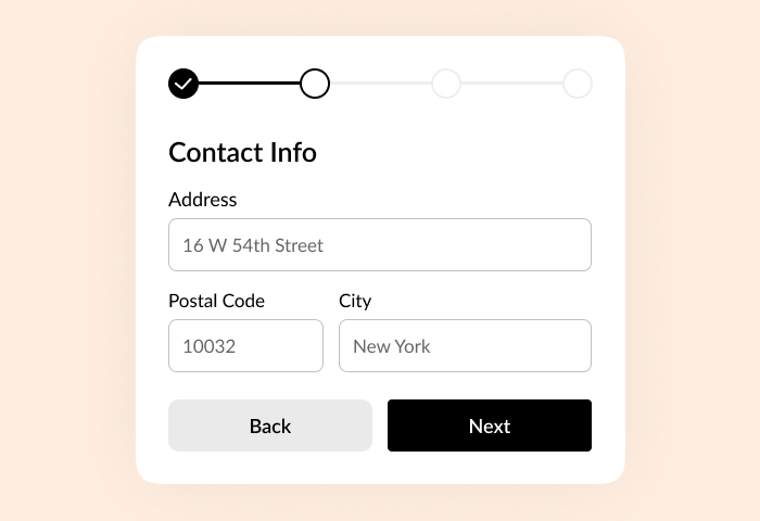
Seeing how far they've come and how little is left motivates users to finish, making each completed step feel like a small victory.
Well-executed multi-step forms can significantly boost conversion rates by 300% when making the process less daunting and more engaging.
Final Thoughts
Great form design is more than the looks. It also considers usability, psychology, and performance. By following these best practices, you’ll not only make your forms easier to complete but also create a more positive user experience that drives real results.
What You Should Implement Today !
- Reduce the number of fields.
- Use clear labels and error messages.
- Make your CTA strong and specific.
- Test and improve constantly.
- Enable autofill option
- Build trust with visual cues
Do you want to design high-converting forms easily? Try Rebolt form builder, an intuitive tool that helps you build beautiful, responsive, and smart forms without writing a single line of code.
Sign Up your free Account & Create Unlimited Forms
Create highly customizable and user-friendly online forms instantly using Rebolt's drag-and-drop feature.
