
.svg)
How to Design Mobile-Friendly Forms for Maximum Conversions?


Did you know that over 58% of all web traffic comes from mobile devices? In an era where smartphones are the primary gateway to online content, businesses can no longer afford to ignore mobile optimization, especially when it comes to forms.
Whether it's a contact form, signup form, or lead capture form, it plays an important role in turning visitors into customers. However, studies show that up to 67% of users abandon a form entirely if it’s not mobile-friendly. That means a poorly designed form could be costing you more than half of your potential conversions.
Mobile users expect simplicity, speed, and seamless interactions. Forms that require too much typing, aren't touch-optimized, or load slowly often lead to frustration and lost leads.
In this comprehensive guide, we’ll explore the essential strategies for designing mobile-friendly forms that convert. From smart layouts and responsive design to intuitive field types and faster performance, these actionable tips will help you reduce friction and lead to a higher conversion rate across all devices.
Why Mobile-Friendly Forms Matter for Your Business?
According to Statista, over 58% of global website traffic comes from mobile devices. That means more than half of your potential customers are experiencing your forms on a smartphone not a desktop.
Yet, many websites still use forms designed for desktops, resulting in poor usability, high abandonment rates, and lost conversions. Here’s why optimizing your forms for mobile is absolutely essential:
1. Mobile Traffic Dominates the Web
Recent studies show that more than half of all global web traffic comes from mobile devices. This means that the first interaction a user has with your form is more likely to happen on a phone than on a desktop. If your form is not displayed properly or is difficult to fill out on mobile, users will quit it without hesitation.
2. Mobile Optimization is a Google Ranking Factor
Google uses mobile-first indexing, meaning it primarily uses the mobile version of your site for indexing and ranking. Poor mobile usability such as non-responsive form fields, slow load times, or frustrating layouts can directly affect your SEO performance and reduce your visibility in search results.
3. Better User Experience Increases Form Completion Rates
Mobile users want fast, frictionless experiences. A mobile-friendly form that’s easy to read, quick to complete, and visually accessible encourages higher engagement and submission rates. On the other hand, forms with too many fields, small tap targets, or complicated layouts are more likely to be abandoned before completion.
4. Faster Forms Lead to Higher Conversions
Speed and simplicity are critical on mobile. A form that loads quickly and is easy to navigate reduces cognitive load and boosts the likelihood of completion. Businesses that invest in mobile-optimized forms often see a measurable increase in lead generation, sign-ups, and customer inquiries.
5. Your Brand’s Credibility is on the Line
A poorly designed mobile form can damage a visitor’s perception of your brand. First impressions matter, and if your form looks outdated, broken, or hard to use on a mobile device, it reflects negatively on your overall credibility and professionalism.
10 Key Principles of Mobile-Friendly Form Design
Now, let's explore the core principles that underpin effective mobile form design:
1. Design for Thumb Zones and One-Handed Use

Most mobile users navigate with one hand, especially using their thumbs. Placing key elements in natural thumb zones improves usability.
- Keep form fields and CTAs within easy thumb reach.
- Avoid placing important actions near screen edges or corners.
- Use sticky or floating "Next" or "Submit" buttons for long forms.
2. Keep Forms Short and Focused
Mobile users are often in a hurry. Long forms on small screens can quickly become overwhelming, leading to high drop-off rates. The goal is to collect only the most essential information.
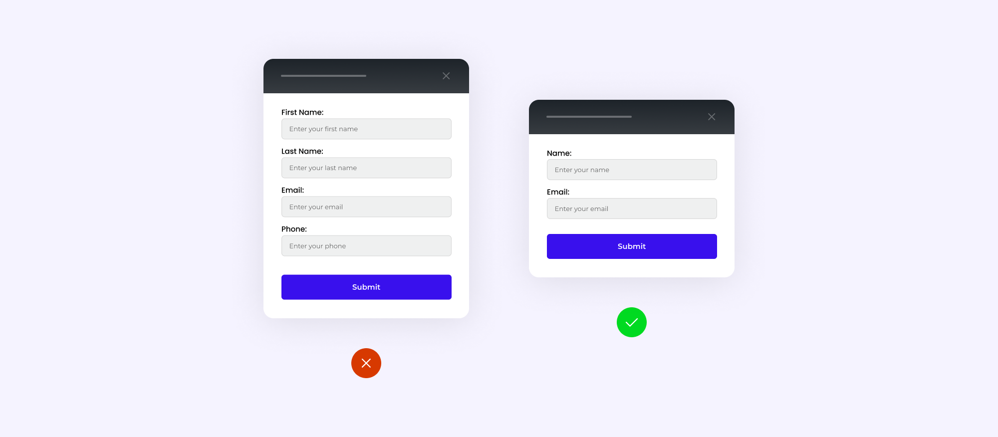
- Ask for only what’s absolutely necessary (e.g., name, email).
- Break long forms into multi-step forms.
- Use progress indicators to show form completion.
- Avoid optional fields unless they're truly valuable.
3. Optimize Input Field Sizes and Spacing
Small or tightly packed fields can frustrate users and cause mistypes. Well-sized and well-spaced input fields make form completion easier.

- Make fields large enough to tap easily (minimum height: 44px).
- Provide ample vertical spacing between fields.
- Use border radius and padding for better touch control.
- Ensure consistent margin and padding for form elements.
4. Enable Smart Mobile Keyboards and Input Types
Mobile devices allow you to define input types that trigger the correct on-screen keyboard. This small change drastically improves usability.

- type="email" – Displays email keyboard.
- type="number" – Allows number entry.
- type="url" – Shows URL-friendly keyboard.
- Use autocomplete &autocorrect for better user experience.
- Add placeholder text for quick instructions.
5. Use Clear and Tap-Friendly CTA Buttons
Your call-to-action (CTA) button is where conversions happen. Make sure it’s impossible to miss or mistap.

- Use bold, contrasting colors.
- Make buttons at least 44x44px (Apple’s guideline).
- Add generous padding around buttons.
- Use action-oriented text like: “Get Started Now”, “Claim Free Trial”
6. Implement Real-Time Field Validation
Don’t wait until form submission to show users their mistakes. Real-time validation guides them gently and prevents frustration.

- Don’t wait until form submission to show users their mistakes. Real-time validation guides them gently and prevents frustration.
- Use color codes (green for success, red for errors).
- Display concise error messages (e.g., “Invalid email format”).
- Avoid reloading the page to show errors.
7. Use Conditional Logic to Simplify Forms
Not all users need to see the same fields. By using conditional logic, you can dynamically show/hide questions based on previous answers.

- Reduces visual clutter.
- Makes forms feel shorter.
- Tailors the experience to the user.
8. Ensure Fast Load Times
Mobile users expect speed. A form that takes too long to load will result in immediate abandonment.

- Compress form assets (images, JS, CSS).
- Avoid using heavy third-party scripts.
- Use asynchronous form submissions to avoid full page reloads.
- Host forms on a CDN or use a lightweight form builder like Rebolt.
9. Test Across Devices and Screen Sizes
Your form might look great on an iPhone 14 but break on a small Android screen. Testing ensures that all users get the same great experience.

- Different screen sizes (4.7” to 6.7”)
- Browsers (Chrome, Safari, Firefox)
- Operating systems (iOS, Android)
10. Track, Analyze, and A/B Test Form Performance
Design is just the beginning. Monitor how users interact with your form and continuously optimize it for better results.

- Test different button placements.
- Compare single-step vs multi-step forms.
- Change field labels or CTA text.
Build Mobile-Optimized Forms in Minutes with Rebolt
Designing a high-converting mobile form isn’t just about following best practices, it’s also about choosing the right form builder tool. That’s where Rebolt comes in.
In a world where people fill out forms on the go whether they’re signing up for a newsletter, requesting a demo, or placing an order, mobile responsiveness is non-negotiable. A single design flaw or formatting issue can cause users to drop off instantly. That’s why Rebolt is built from the ground up with mobile-first performance in mind.
Whether you're collecting leads, running a feedback survey, or processing registrations, Rebolt helps you build high-performing mobile forms with zero technical hassle.
Sign Up your free Account & Create Unlimited Forms
Create highly customizable and user-friendly online forms instantly using Rebolt's drag-and-drop feature.

%201.svg)